Ten Years of Cabin Rental Website Design
Bear Track Lake Adventures, the website I made for my parents’ cabin rental business, recently turned ten years old. With that, I’d love to take this opportunity to both look at the history of the website and also introduce the new redesign.
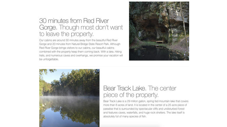
For context, Bear Track Lake Adventures is a cabin rental business in the Red River Gorge area in Kentucky. There are three cabins for rent: Bear Lair, A Sleepy Bear’s Dream, and A Sneaky Bear’s Hideaway. They are all located next to a six-acre lake on a beautiful piece of property that I’m lucky to have grown up on.
While there are three cabins now, the business actually didn’t start with cabin rentals. When we started, we only had fishing and camping in tents and caves. And of course, we needed a website to promote the new business.
I unfortunately don’t have screenshots of the initial website, which was a WordPress site created by a local developer. Being a sophomore in high school who was interested in computers, I tried to make a website including our new cabin that we liked better. I don’t remember the exact software I used, but it was a basic WYSIWYG editor included in our hosting package.
Initial design
Here’s a screenshot of the cabin page on that site courtesy of the Wayback Machine: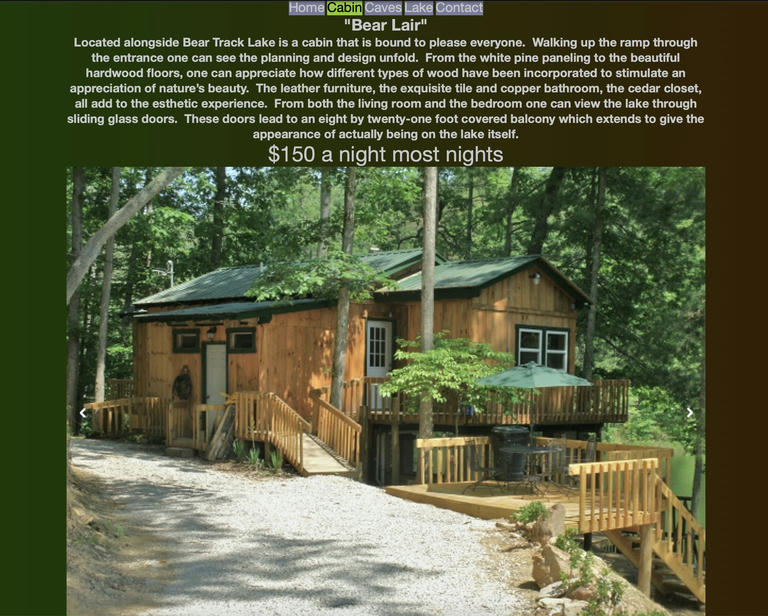
Quickly after launching this version, there was some design iteration, like making the navigation buttons bigger and the image carousel smaller. Here’s the same page after this: The left to right green and brown gradient was also swapped to a top to bottom one. ¯_(ツ)_/¯ 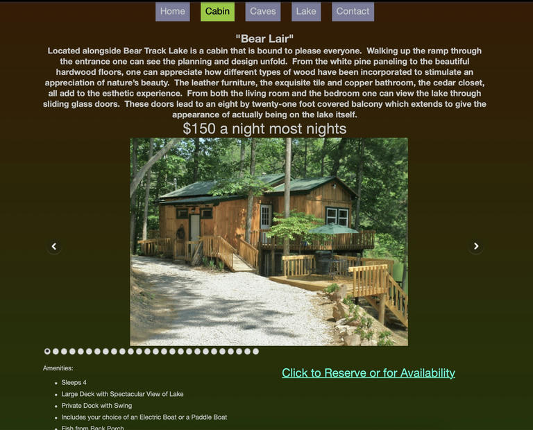
And the homepage:
While this does look dated now, it was a success, drawing plenty of new visitors to the business. The design was something we were proud of, and it confirmed for my parents to trust a critical part of their business to their high schooler.
Other pages followed the same basic layout, with the gradient as a background, centered text throughout the page, and a few pictures scattered around.
Second design
Of course, this design did not last forever. The second cabin was ready to rent, and this was a great excuse to redesign the website, using the newly updated website builder.
This redesign captured a major change for the business. We were now solely focused on cabin rentals, as they proved more lucrative than camping. I swapped “Adventures” in the website title with “Cabins” to help signify this, while also hoping that it would also help with SEO.
For better or worse, the background gradient was gone, replaced with a subtly dotted background that was the default of the theme I was using.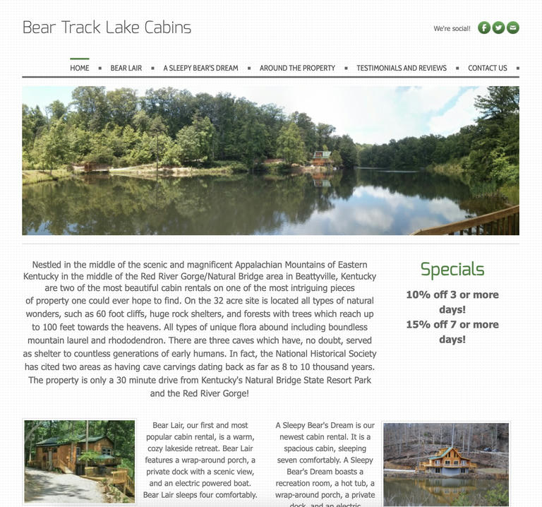
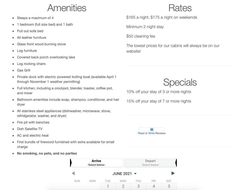
The individual cabin pages kept the same general structure, with a description on top, an image carousel in the middle, and amenities and booking information below. Unfortunately, the Wayback Machine did not capture the picture in this screenshot, but it was the same. 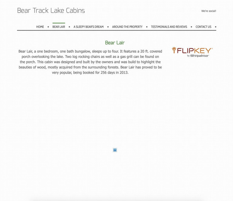
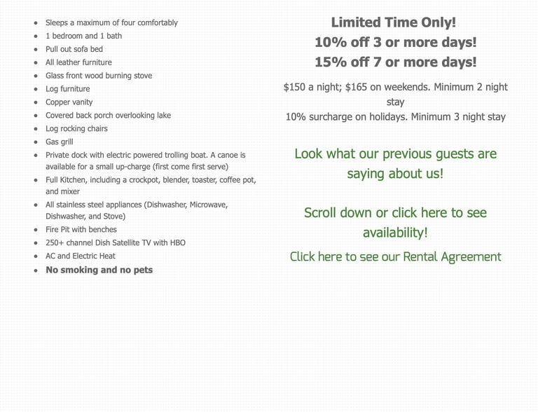
This design was also the first to feature an embedded booking calendar from the vacation rental management software we used, allowing guests to book a reservation right on the page.
Third design
While this version served us well for a few years, the third cabin’s completion presented a problem. The website builder I was using was free for six pages, but we wanted to add a seventh …
Ever the frugal one, I took this as an opportunity to try web development without a website builder. Fresh off my first year of undergrad, I spent the summer learning Bootstrap and creating a new website.
I found a default carousel theme that seemed like a good start, and without really knowing what I was doing, I started editing the HTML and CSS to get a workable homepage.
This was the eventual outcome: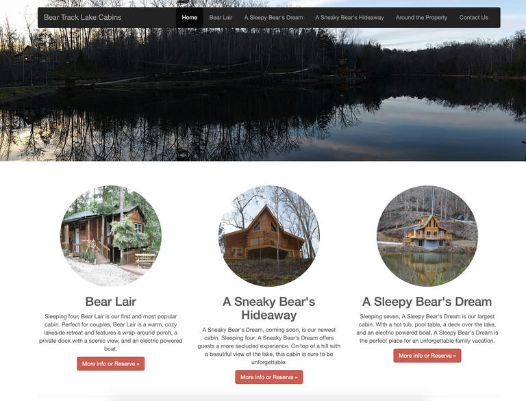
With confidence from this, I started working on the individual cabin pages, ending up with the following: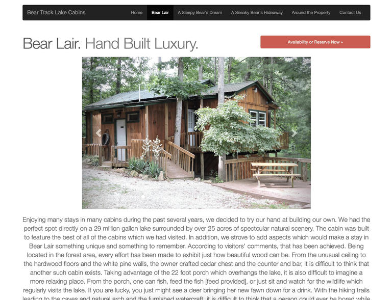
And that was it. This design and version persisted. It needed only minimal changes over the six-year lifespan. While it was far from perfect, it worked. It drew compliments from customers and helped support the business’s growth.
But it was time for a redesign.
New design
The old website, unfortunately, had quite a bit of technical debt, and it was way harder than it should be to make changes. With the new website, after the initial setup, I wanted to minimize the amount of time I’d need to spend on it to make any necessary changes. In fact, Zola builds the new website from scratch in under two seconds.
The new website is built using the excellent Zola static site engine, which builds the output HTML files from a series of Markdown files and Tera templates. This helps reduce the duplication in the project by allowing each component of the website, like the footer or menu bar, to be declared in one place. This is already a vast improvement over the previous website, which was created by manually editing HTML files from a Bootstrap template.
Here’s the new landing page: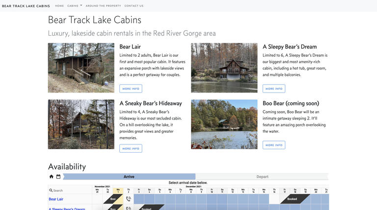
And here’s an individual cabin page: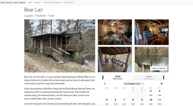
I’m far from a good designer, but I’m proud of how the new website turned out. I’m excited to monitor the analytics over the next year, and I’m excited to be able to make changes with minimal effort going forward.
It’s an interesting experience looking back at the history of a project that I’ve maintained for 40% of my life. This website has had a huge impact on both my professional trajectory and my parents’ business, and I’m grateful.